Linear Regression with techBASIC

Linear Regression with techBASIC
Data is rarely perfect. Whether from measurement error, noise or just random fluctuations in the population being measured, data almost never fits the precise equations we see in textbooks. Linear regression is the most common technique used to fit a mathematical equation to real data. It can cut through the noise to give a good approximation to the equation that really represents the underlying data. It can also be used to predict future measurements.
This article looks at how to do linear regression in techBASIC. We’ll create a program to fit a line through noisy data points, plot the data and the fit so we can visually see if the results make sense, and calculate the goodness of fit to see how good the fit actually is. Of course, not all data fits a line, so we’ll also look at fitting a polynomial to the data.
Basic Linear Regression
Before we can do a linear regression, we need some data. We’ll generate the data using another program. The data will come from the equation

Since we want noisy data, we’ll use random numbers with a normal distribution and a standard deviation of 1/20 to generate some y values. These will come from 100 x values randomly scattered from 0 to 10. Here’s the program. If you’d rather not type it in, you can copy it from this blog and paste it into a blank program, or download the source from the end of the article and move it to your iPhone or iPad using iTunes. See the Quick Start Guide on the techBASIC documentation page if you are unfamiliar with moving programs using iTunes.
! Generate data points for a regression using normally distributed
! variation from f(x) over the specified range.
points = 100
minX = 0
maxX = 10
OPEN "regression_data.txt" FOR OUTPUT AS #1
Math.setSeed(42)
FOR i = 1 TO points
x = minX + Math.rand*(maxX - minX)
y = Math.normal/20 + f(x)
PRINT #1, x; ","; y
NEXT
FUNCTION f(x)
f = 0.6*x - 3
END FUNCTION
As you can see, the program writes the points to a file named regression_data.txt. The file ends up with 100 lines, each containing an x and y value separated by a comma. This is the format for the comma separated value file, abbreviated as CSV file. Pretty much any spreadsheet or database can read and write CSV files. In fact, some of the real data I’ve fit using techBASIC started out in an Excel spreadsheet on my desktop computer.
Rather than using the random number generator built into BASIC, this program is using a more advanced random number generator from the Math class. This random number generator uses the Mersenne Twister algorithm, which is considered a great source of pseudo-random numbers for simulations. The random number generator built into BASIC would have worked just fine, but the one in the Math class has the call Math.normal, which returns normally distributed random numbers.
Now that we have some data, it’s time to read and process it. Most of the program is reading the data or creating the plots. For the most part, we’ll skip over those parts. If you would like to learn more about creating plots in techBASIC, see the blog on using techBASIC as a graphing calculator.
! Read the points to fit.
OPEN "regression_data.txt" FOR INPUT AS #1
points = 0
WHILE NOT EOF(1)
points = points + 1
INPUT #1, a, b
WEND
minX = a
maxX = a
minY = b
maxY = b
CLOSE #1
DIM x(points), y(points), pairs(points, 2)
OPEN "regression_data.txt" FOR INPUT AS #1
FOR i = 1 TO points
INPUT #1, x(i), y(i)
pairs(i, 1) = x(i)
pairs(i, 2) = y(i)
IF minX > x(i) THEN minX = x(i)
IF maxX < x(i) THEN maxX = x(i)
IF minY > y(i) THEN minY = y(i)
IF maxY < y(i) THEN maxY = y(i)
NEXT
CLOSE #1
! Do the regression.
coef = Math.polyfit(x, y)
! Draw the points and the fit.
DIM p AS Plot
p = Graphics.newPlot
DIM scatter AS PlotPoint
scatter = p.newPlot(pairs)
scatter.setStyle(0)
scatter.setPointStyle(2)
DIM fitPlot AS PlotFunction
fitPlot = p.newFunction(function fit)
fitPlot.setColor(1, 0, 0)
title$ = "f(x) = " & format(coef(1))
title$ = title$ & " + " & format(coef(2)) & "*x"
title$ = title$ & ", R^2 = " & format(Math.rSquare(x, y, coef))
p.setTitle(title$)
p.setView(minX, minY, maxX, maxY, 1)
System.showGraphics
! This function evaluates the fit. It is used to plot the
! fit for comparison with the points and the actual function.
FUNCTION fit (x)
fit = Math.poly(coef, x)
END FUNCTION
! Format a value with three decimal digits.
FUNCTION format (x AS DOUBLE) AS STRING
sign$ = ""
IF x < 0 THEN
x = -x
sign$ = "-"
END IF
x$ = STR(INT(x*1000))
WHILE LEN(x$) < 4
x$ = "0" & x$
WEND
format = sign$ & LEFT(x$, LEN(x$) - 3) & "." & RIGHT(x$, 3)
END FUNCTION
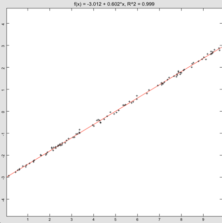

That’s not exactly the equation we used to generate the data, but it’s correct to two significant digits—not bad, considering the error introduced by the random number generator.
The part of the program that actually does the linear regression is
coef = Math.polyfit(x, y)
It takes two matrices containing the x and y points as inputs and returns an array with two elements, the intercept and slope for the fitted line. To calculate a y value from the array, you can use the equation
y = coef(1) + coef(2)*x
or, as the program does in the function fit, you could just call the poly function from the math class.
y = Math.poly(coef, x)
There are several ways to get a grip on whether the fit is a good one. One is to look at the plot, which is always a good idea. A more analytic approach is to calculate the r2 value, commonly called the goodness of fit. The program does this in the line that is creating the title for the plot.
title$ = title$ & ", R^2 = " & format(Math.rSquare(x, y, coef))
The actual call to find the goodness of fit is Math.rSquare, which takes the original x and y vectors used in the fit, as well as the coefficients returned by Math.polyFit. Values close to 1 are considered good, so the 0.999 for this fit is really quite good. Values close to 0 indicate there isn’t really much correlation between the x and y values.
Polynomial Regression
FUNCTION f(x)
f = 0.6*x - 3
END FUNCTION
to
FUNCTION f(x)
f = sin(x)
END FUNCTION
Also, change the maximum x value, found near the top of the program, from
maxX = 10
to
maxX = 1.5
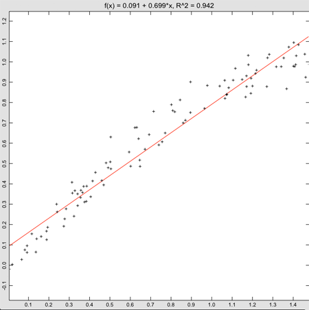
Linear regression actually returns a pretty good fit to the data, even though we know the sine function isn’t really a straight line. The goodness of fit is 0.942, which also isn’t bad. Of course, things would look much worse if we had selected a large range for the x values. Even with this range, though, it’s easy to see from the plot that the values at the left and right edges tend to lie below the fitted line, and the ones in the middle tend to lie above it. This shows the power of using an analysis package that shows the data, rather than just doing a fit. Clearly, we don’t want to fit this data to a straight line.
It turns out that a polynomial works really well. The Taylor series expansion tells why. The value of the sine of a number can be calculated from the infinite series

While we generally talk about linear regression, the math behind the technique also works well for polynomials. A slight change to the line that calculates the fit, from
! Do the regression.
coef = Math.polyfit(x, y)
to
order = 2
coef = Math.polyfit(x, y, order)
updates the program to create a fit of the form

It’s also easy to get higher order polynomial fits. Changing the order to a larger number creates a correspondingly higher order polynomial fit.
The title should reflect this higher order fit, so the line
title$ = title$ & " + " & format(coef(2)) & "*x"
needs to be updated to
FOR i = 1 TO order
title$ = title$ & " + " & format(coef(i + 1))
IF i = 1 THEN
title$ = title$ & "*x"
ELSE
title$ = title$ & "*x^" & STR(i)
END IF
NEXT
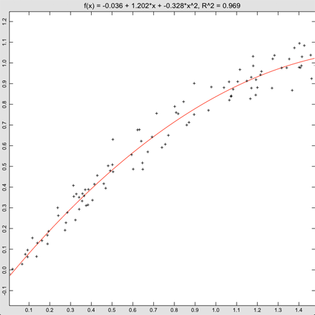
With these changes in place, the fit is looking pretty good.
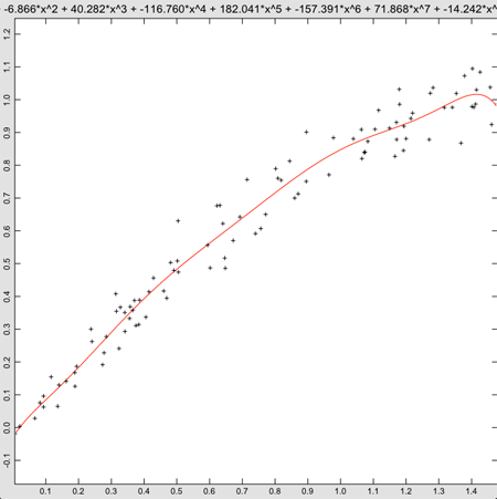
While the fit is technically better, this just doesn’t look right. Sure, the polynomial is finally starting to dip at the right end of the graph, but the only way we can really justify this is that we know the data came from the first part of a sine wave. Not knowing that, it’s hard to justify using a ninth order polynomial. After some experimenting, I settled on a fifth order polynomial, but even that is hard to justify without knowing the source of the data. This brings up a weakness of polynomial regression. If the order is high enough, eventually the curve will fit the data. In fact, if the order is one less than the number of points, and all of the points have distinct x values, the curve will pass right through every point. Just as in our example, though, smoothness is lost, and the fit becomes more and more tortured. It’s always a good idea to check the plot to make sure the results make sense.
Further Reading
By far the best book I’ve found for regression is Data Reduction and Error Analysis for the Physical Sciences, Philip R. Bevington. My 1969 edition is pretty tattered, showing all of the wear of a well-loved book, but it’s still available. (And no, I didn’t get it in 1969—I’m not that old.)
There is, of course, an article on Wikipedia. It gives a pretty good overview and covers other ways of looking at the goodness of fit.
A special case for regression is fitting data that comes from an exponential or logarithmic source, like radioactive decay or population growth. Math.polyFit can still be used to do the heavy lifting, but you need to preprocess the data and post process the fit. There are many good overviews of this topic, including this Wikipedia article.
Friday, May 18, 2012
